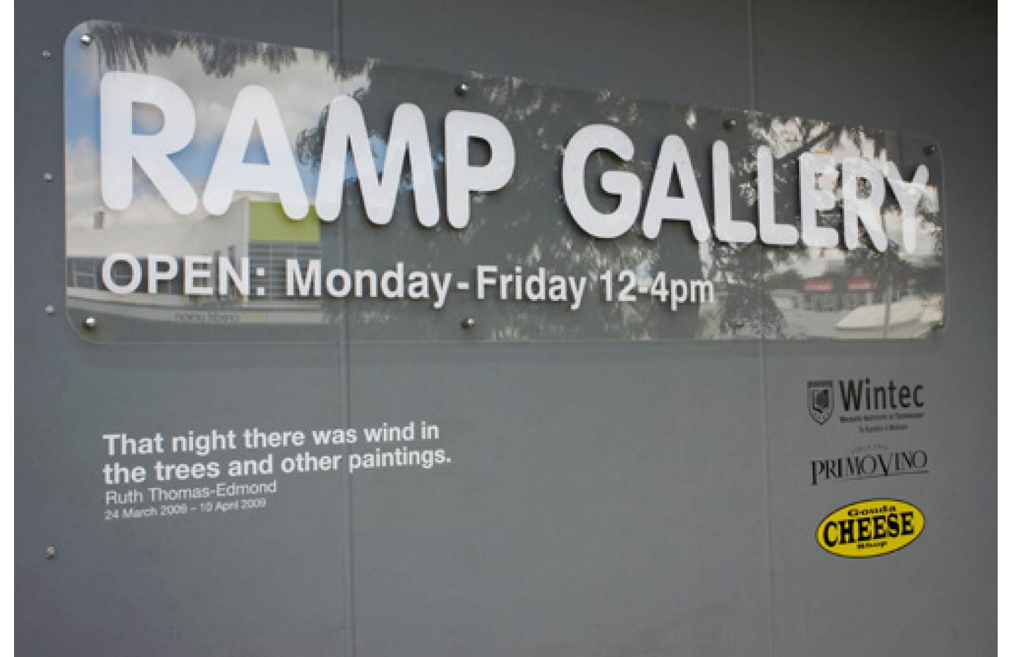
Poster Exhibition
works by international designers
- 3 Aug - 21 Aug, 2009
If you give an infinite amount of designers an infinite amount of time, eventually they will implement the same design solution.
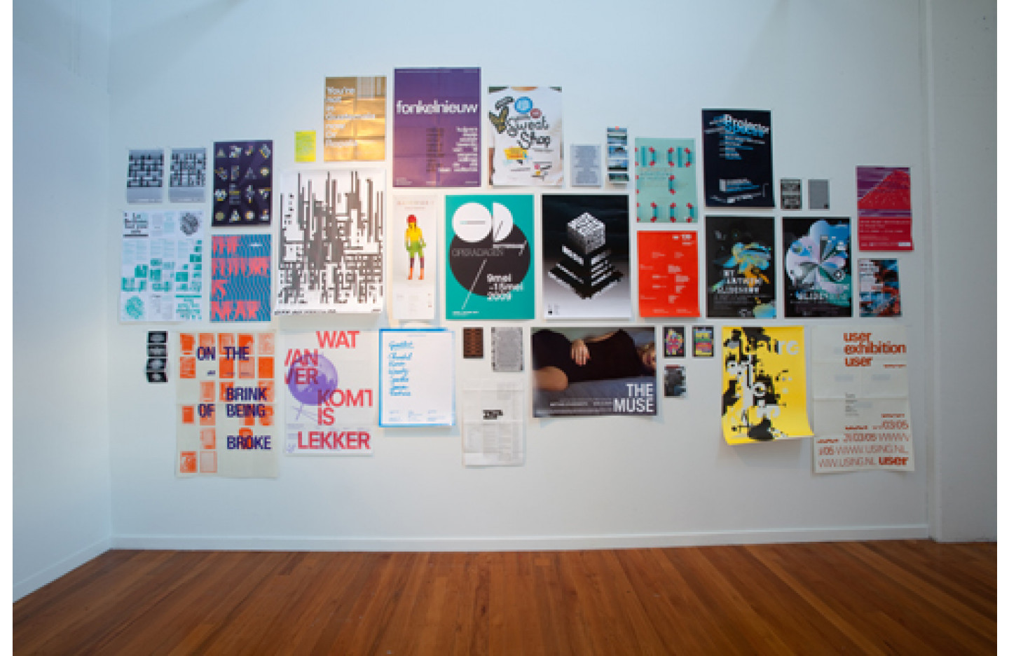
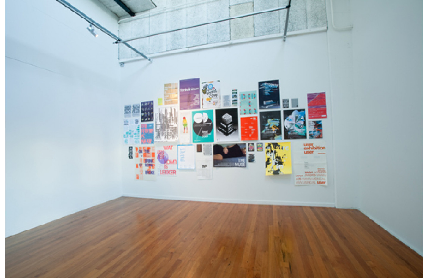
Similar content does not equate to similar format nor does comparable technique translate to output that resembles each other. Although there are only a handful of ingredients to a piece of design work promoting an event such as the title, time, date and place, there are many layers of content for the designer to order. Stylistic features push against or align with the design's purpose; decoration entices the reader with visual cues and sparks interest. Stripping these away, all that remain is letterform, words and typefaces. Ordered in levels of hierarchy and arranged in groups by function this collection of words is text-based information in its basic form, laden with bolds, italics, capital letters, colour and spacing. Removing these the designer/reader is left with pure content, the purpose of which is only to inform: the title, time, date and place. This information transfer is no different than a handwritten note providing all of the necessary specifics: This is what is happening...be there, then.
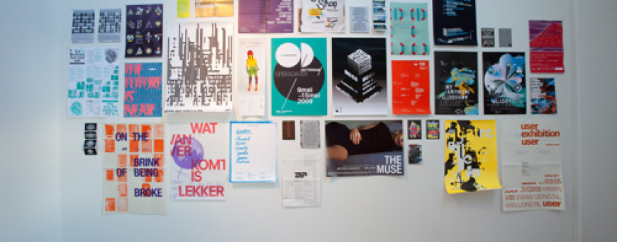
Early this year an email went out inviting designers to submit examples of posters or flyers that publicised or promoted an exhibition. All featuring similar content, the collection in Ramp Gallery exists as a tool for education, to encourage students and professionals alike to compare and contrast the order of things, to question why similar content drives such different results and to see new solutions to an age-old design problem.
Similar content does not equate to similar format nor does comparable technique translate to output that resembles each other. Although there are only a handful of ingredients to a piece of design work promoting an event such as the title, time, date and place, there are many layers of content for the designer to order. Stylistic features push against or align with the design's purpose; decoration entices the reader with visual cues and sparks interest. Stripping these away, all that remain is letterform, words and typefaces. Ordered in levels of hierarchy and arranged in groups by function this collection of words is text-based information in its basic form, laden with bolds, italics, capital letters, colour and spacing. Removing these the designer/reader is left with pure content, the purpose of which is only to inform: the title, time, date and place. This information transfer is no different than a handwritten note providing all of the necessary specifics: This is what is happening...be there, then.
Early this year an email went out inviting designers to submit examples of posters or flyers that publicised or promoted an exhibition. All featuring similar content, the collection in Ramp Gallery exists as a tool for education, to encourage students and professionals alike to compare and contrast the order of things, to question why similar content drives such different results and to see new solutions to an age-old design problem.